The Psychology of First Impressions in Brand Design
Alice walks into an interview room and the interviewers immediately like her; she’s smiling, she looks relaxed, she dressed in a suit dress and heels and she smells nice. She hasn’t said a word yet and it hasn’t even been up to ten seconds but they immediately think she’s the one for the role. What did Alice do? She made a great First Impression. A first Impression is the initial opinion or feeling you have about someone upon meeting them for the first time. We are going to looking at The Psychology of First Impressions.
Since we are talking about how this applies in brand design, let’s imagine your brand walking into a room. What would it say without speaking? That’s exactly what happens when someone lands on your website, sees your logo, or watches your launch video.
Within milliseconds, your audience forms a perception about your brand. It’s not based on your mission statement or product quality. It’s based on design. Motion, color, layout – these seemingly small details play a massive psychological role in determining how your brand is perceived and remembered.
This blog will dive into how the psychology of first impressions works in brand design and how your choices in motion graphics, color theory, and layout can impact how your brand is seen and remembered.
The Science Behind First Impressions
Psychologists have found that humans form first impressions in as little as 50 milliseconds. That’s faster than the blink of an eye. During that tiny moment, the brain is busy processing visual cues to decide: Do I trust this brand? Do I want to know more?
This instant judgement is influenced by:
- Visual coherence: Do elements look organized or chaotic?
- Color usage: Does the color feel warm and inviting or harsh and cold?
- Motion cues: Are animations smooth and purposeful or random and distracting?
When brands nail these, they earn attention, trust, and often, action thereby boosting brand retention.
Color: The Emotional Trigger
Color is one of the most powerful tools in your branding arsenal. It is just about looking pretty, yes but it’s also about feeling right. Each color taps into a different part of our brain and stirs up certain emotions.
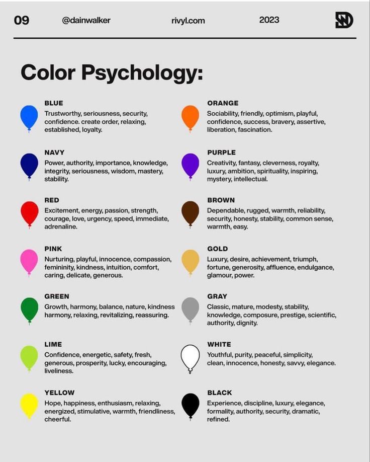
Here’s a breakdown of a few color psychologies:
Blue – Trust, Reliability, Calm
Emotionally evokes security, professionalism, calmness, and trustworthiness. It’s a favorite in finance, tech, and healthcare industries because it puts people at ease and builds trust.
Brands that use blue:
- Facebook – Suggests trust, openness, and communication.
- PayPal – Reinforces financial security and reliability.
- LinkedIn – Professionalism, confidence, and career growth.
- Oral-B – Cleanliness and trust in healthcare.
Best for Banks, fintechs, tech brands, healthcare, B2B companies.
Yellow – Optimism, Energy, Warmth
Emotionally evokes happiness, friendliness, and creativity. It grabs attention and triggers feelings of cheerfulness and joy.
Brands that use yellow:
- McDonald’s – Happiness, hunger stimulation, and approachability.
- Snapchat – Youthfulness, fun, and energy.
- IKEA – Warmth and affordability, especially paired with blue for trust.
Best for Food & beverage, kids’ products, retail, creative services.
Purple – Creativity, Luxury, Imagination
Emotionally evokes sophistication, royalty, mystery, and innovation. Often used to suggest premium quality and out-of-the-box thinking.
Brands that use purple:
- Cadbury – Richness, indulgence, and tradition.
- Twitch – Innovation, entertainment, and creativity.
- Hallmark – Emotional connection and quality storytelling.
- Yahoo! – Quirkiness and individuality.
Best for Beauty, luxury, education, tech, wellness, entertainment.
Green – Growth, Nature, Health
Emotionally evokes balance, renewal, freshness, and safety. Green is associated with eco-friendliness, health, and financial stability.
Brands that use green:
- Starbucks – Calm, community, and sustainability.
- Spotify – Growth, accessibility, and vibrancy in music.
- Whole Foods – Health and organic living.
- Land Rover – Adventure, resilience, and nature.
Best for Wellness, eco brands, agriculture, finance, travel, sustainability.
When color choices align with your brand personality, the impact is both emotional and memorable.
Motion: Movement that Speaks Volumes
Motion graphics aren’t just aesthetic flair. They’re communication tools.
Smooth transitions, well-placed animations, and interactive motion elements can:
- Guide attention: A bouncing button or subtle zoom leads the eye where it needs to go.
- Tell a story: Explainer videos can break down complex offerings in seconds.
- Convey professionalism: Clean animations scream “high quality” without saying a word.
For Example; Hashit, a socio-fintech platform, uses motion graphics to show how seamless and connected their product experience is. Instead of long texts, motion guides the user, showing real-time interactions and simplifying their onboarding process.
When done right, motion creates flow. It reduces friction and makes your brand experience feel modern, intentional, and intuitive.
Layout: The Silent Architect of Perception
Have you ever landed on a website and immediately felt confused? That’s poor layout at play.
Layout affects how your audience experiences your brand story. A good layout:
- Organizes content logically
- Prioritizes the most important elements
- Feels clean and uncluttered
Brands like Zikoko, a Nigerian pop culture media platform, use grid-based layouts to make heavy content feel digestible. Each post or story has breathing space, and the hierarchy of information is clear.
A strong layout invites users to explore. A weak one pushes them away.
Consistency: The Glue of First Impressions
While first impressions happen quickly, brand perception is shaped over time. Consistency in color, motion, typography, and layout reinforces your identity.
For example, Kuda Bank maintains consistency in their color palette (soft purples and whites), motion (subtle UI animations), and tone. Whether you’re on their mobile app or Instagram page, it all feels the same. That cohesion builds trust.
The Risk of Getting It Wrong
When first impressions fail, it often leads to high bounce rates, low engagement, and poor retention. Poor use of color can create emotional dissonance. Chaotic layouts can cause confusion. Random animations may feel juvenile or unprofessional.
That’s why design should never be an afterthought. It’s a strategic decision with real psychological impact.
Making It Work for Your Brand
Here are a few quick tips to make your first impression unforgettable:
- Know your audience: What emotions do you want to trigger?
- Define your brand personality: Is your brand Bold, Playful, or Serious?
- Choose colors with intention: Use color psychology as a guide.
- Add motion with purpose: Keep it subtle but impactful.
- Keep layouts clean: Prioritize hierarchy and breathing room.
Conclusion
The brands that win are the ones that understand how people think. The psychology of first impressions is your secret weapon. Use it.
Your color isn’t just a color. Your animation isn’t just decoration. Your layout isn’t just boxes on a screen. They’re all part of the silent conversation your brand has with the world. Make that first conversation count.
Would you like help improving your brand’s first impression? Let’s create something unforgettable together.